Review: HyperDot
Whenever I try to critique HyperDot, the new title from Tribe Games and GLITCH, my head runs into several contradictions. It is very easy to describe what this game is, yet I struggle to explain why I enjoy it. The music and aesthetics are soothing and relaxing, but the frenetic and twitchy gameplay is anything but. It is intensely difficult, yet extremely accessible to any player in a way that I very much admire.
Thanks to a minimalist art style and a simple overall premise, HyperDot is the most “video-gamey” video game I’ve played in quite some time. It is exciting and smartly crafted, and it would be a perfect addition to any local party game lineup. But even with the same mechanics and concepts in single-player, the game carries a completely different type of energy, going from frantic and competitive to tense and stressful.

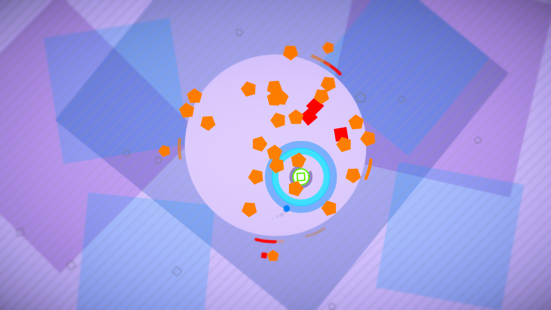
The idea behind HyperDot feels like something that could have been conceptualized in the earliest days of video game development, but it is built with very modern sensibilities. Players will control a single dot each with their analog stick, closed off in a circular arena and dodging a number of different moving obstacles and enemies (represented by other geometric shapes) that come their way.
In the single-player campaign, missions provide a variety of challenges: keep your dot alive in a set amount of time, or gather a certain number of tokens, or fill up a meter by occupying a particular area in the field. Enemies include squares that travel in a straight line, hexagons that aim for the player, triangles that home in on players, stars that start and stop, and plus signs that shoot off their own bullets. Needless to say, the farther I got through the 100+ trials in the campaign, the more hectic and dense the arena got.
When adding other players in the mix (up to four in total), it becomes more of a cutthroat battle for survival, with the last dot standing being the victor. Modifiers from the campaign trials can also be applied in multiplayer, like a slippery ice arena, or shields that allow dots to take multiple hits—with the latter, some multiplayer matches become a game of bumper cars. Rounds are short with little waiting time in between, and HyperDot has an excellent menu and interface that allows players to drop in and drop out matches at any time.

The UI isn’t the only visual element to gawk at in HyperDot. Some may find it hard to imagine that a video game that uses very basic shapes could wring as much artistry as any other modern video game, but Tribe Games succeeded with literal flying colors. To compare it to a visualizer or a really cool screensaver is apt, but possibly a bit too reductive. It is something to be seen to be understood. Many games trigger a sense of “satisfaction” from the feel, but HyperDot somehow does it just with the look.
The art style makes excellent use of color and lighting, making each different enemy type distinct to signal your brain just how to handle the constantly changing situations in the arena. The backgrounds are ever-changing and pleasing to the eye without being distracting. And best of all, this game has additional accessibility options for colorblind people. Graphics and UI mesh together seamlessly, in a way that even just navigating through the menu feels like an essential part of the overall experience (the menu also tells the player how much time they spend in the menus versus actually playing the game, interestingly enough).
Visuals also become an essential part of certain trials and arenas; one gameplay effect called “SuperDot” acts as a blatant tribute to Superhot, with all enemies only moving whenever the player does, creating a cool slo-mo effect as players tread carefully to slalom their dot through the crowded field. And then there’s the “Dark Arena,” which essentially puts the entire arena in the dark and obscures the enemies as shadows, with only a limited radius of light around your dot.

That is all to say that I still have some difficulty describing just what it is about the gameplay that resonates with my head. HyperDot intrigued me the more I got deeper into the campaign, and even as the enemy types and other modifiers were becoming familiar, the game kept mixing and matching these concepts to make every trial feel somewhat unique. Some levels may have you move your dot around in a panic, with only reflexes and luck at your side. Other ones will turn known concepts on their head and have you be a bit more contemplative about every little movement you do.
Having neither the skill nor the patience to wrangle with level editors, I am curious to see what HyperDot players do with the one provided in this game. Players can plan out waves of enemy units to attack, mess with the size of the arena, or add many of the aforementioned modifiers. From the single-player campaign, I experienced trials that had enemies move in patterns or create shapes and obstacles, many of these trials requiring some sort of specific strategy rather than franticness and pure luck. If any players out there are just as enthusiastic as I am but far smarter than me when it comes to game design, I’m sure that there is some cool user-created content on its way.
I played HyperDot on Xbox One, but the game will also be released on itch.io and Steam, with the game touting full compatibility with the Xbox Adaptive Controller. Having just one standard Xbox controller, playing the game was a lonely affair, a vastly different experience than a multiplayer demo session I had tried out months ago. As the single-player trials became harder, my f-bombs became more frequent.
HyperDot is gorgeous, slick, thoughtful, responsive, accessible, and contains plenty of chill beats to relax to. It’s one that has to be felt to be fully understood—just be sure to have some friends on the couch with you to experience it with you too.
This game was reviewed on Xbox One with a code provided by the developer.


1 thought on “Review: HyperDot”